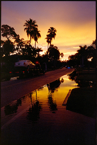
CineStill 800T and the stubborn green or cyan tint

Hey there! Is anyone else having problems with scanning CineStill 800T?

I followed (to the letter) the VueScan -> RAW -> NG procedure and I can see a strong tint on my images, looks green-ish (sometimes cyan) if I select the CintStill800T profile. Selecting the neutral profile helps a lot, but there’s still more than I expected.

All settings are left as defaults (I clicked the reset button) + color profile is set to neutral

(the second one - with the CS800T profile will be in another post)

Am I doing something wrong, like should the “out of the box” results look like these and I shall do all the color correction myself? I have more examples like this one. I’m willing to do the homework, just push me a bit in the right direction :wink:

Same with the CS800T color profile. What’s interesting - I can adjust the strength slider but then look at those lights - they become super-magenta, while buildings are still green.

Honestly, I would say that is pretty neutral starting point for Cinestill 800T and this scene. The scene itself is very very tricky to evaluate - because 800T is a tungsten balanced film, and the shoot is looking directly into the light source.

Also, if you look at night photos using CineStill 800T (like here, here, or here), a lot of them do have this green/aqua tint to them - so that does seem to be a tendency of how this film shoots and scans, and is something that a lot of shooters like about it.

It really just depends on the look you want, but two things I would try:

  1. Try adjusting the “highs” color balance to add more red and yellow. I’m guessing the correcting color against the highs here will make the most difference, since it is rendering the brightest point as white, and the lights themselves you probably want to render as warmer.

  2. If you have other images where the conversion turned out better (perhaps of a more neutral, daytime scene), then you can use the “sync scene” feature in NLP to transfer that evaluation onto this image. You may find this can give a more realistic color cast, especially in the highlights.

I use this second trick quite a lot with Cinestill 800T (and in fact, working on a feature at the moment that will do this for you more automatically - taking the context of the entire roll to deliver better results.

For instance, here was the initial conversion of this shot on a roll of 800T:

NLP is trying to balance out the colors, and sees all the red/magenta and not knowing it is a sunset, it thinks “Oh man, we need to add some blue/cyan here.”

SO, I could either manually go in and add back in red/magenta, OR I can give it more context from a neutral scene, and then use that context to try to reconvert it.

Here’s what that same conversion look like, but using the whole roll for context (a feature that will be implemented in v3.0, but that you could get close to now by taking a neutral conversion from the roll, and using “Sync Scene” from that neutral shot onto the trouble shot).

This is much closer to the natural colors in the scene (although pretty much any color balancing algorithm will tell you that it is not “balanced” because all the tones are warm)

Hope that helps!

-Nate
Creator of Negative Lab Pro

2 Likes

Wow, thanks a lot for a detailed answer. It helps a lot - especially examples + guidance about correcting those highs.

What would you use for films with a very distinct character? Would you use the profile or go with neutral? Sure it depends on the use case, but that’s like my first roll with NLP and you’ve got tons more experience. I aim for this “cinematic” look.

I kind of dig the linear+gamma conversion, like a lot. Any comments on that? :slight_smile:

BTW that splash of light - that’s a light leak and not aliens landing :wink:

Again, I appreciate the level of support here.

One more question - the announcement for the 2.1 version says
“These film profiles assume that your light table or scanner light source is ~5,000k”

Now, lightroom’s white balance picker sets the WB to around 3200K - does that mean I should not use those profiles?

That looks amazing! For cinematic look, the linear tone profiles are a good choice!

In my mind, the “cinematic” look is usually 1) lower contrast with more room for dynamics and 2) shows off the color of the light (rather than trying to white-balance it out - so cool scenes look very cold and warm scenes look very warm). You can get the lower, smoother contrast by using one of the linear profiles. The second part is trickier - having a “roll evaluation” algorithm in v3.0 will help with this a lot. With cine films, I tend to use the Film color preset, and try adjusting the amount… but if you have the light source included in the frame, you may also need to adjust the “high” color sliders.

The scanner light source temp and the white balance picker temp are two separate things… the white balance picker temp is being set off the film emulsion itself (not the temp of the light panel).