I’m about to begin a project of digitizing my Dad’s slides from 1971-1983, and then negatives from late '70s - 2005 (when he went digital).
There’s plenty of tips and info about best practices for scanning negatives, so I’m all set there. But I don’t see much about how to optimize slide positive scans. Got any tips about white balance, exposure compensation, etc?
For example, for negatives you expose to the right to gather more detail, but in my tests with slides I’ve kept exp.comp. at 0. It seems fine. Please offer me some, “Well, actuallys”.
I’m using Sony A7IV, Sigma 70mm macro, Negative Supply Light Source 35 LED Panel for Film Scanner (97 CRI), and finally arriving on Tuesday: Essential Film Holder.
My negative scanning settings are: WB auto sunlight, ISO 100, F/8, exp. comp. +1.3 (though I’m not afraid to adjust when it seems necessary). To shoot in the daytime I also made a little light blocking tube that fits snuggly on the lens hood using Rosebrand wool serge 30oz.
EDIT: Regarding exposure compensation and metering mode,
I haven’t nailed down what’s the best interplay. With slides, it’s maybe best at +0 and “full frame”?
As I suggested above, for negatives I’ve created a preset with +1.3. Also use “full frame” metering, or maybe “highlights”?
You found a lot of hints on how to cope with negatives, but good practices for slides are sparse…yet. NLP has acquired features that relate to slides only recently, therefore the knowledge has to be built first and some of it will find its way into the user guide eventually.
According to what I found testing NLP 3.1 with slides, I can just say that necessary measures depend on the slides, their age, degradation, colour shifts, original exposure and whatnot. This means that we’ll have to find our own ways before we can share a “how-to”. And that is your chance to contribute and share your learnings.
I do propose to test and learn systematically
Scan slides with bracketed exposure
Test HDR rendering of bracketed captures of slides
Don’t try to tune single images, but work on batches
Use virtual copies to save drive space and reduce access delays
Think “starting point” instead of “it doesn’t match my expectation”
Also, I propose that you play with the following
Colour Model (Basic, Frontier, Noritsu etc.)
Pre-Saturation (and I mostly use low values to start with)
Border Buffer (as a variation of or added to crop settings)
Roll Analysis (if the slides have been camera scanned with nearly identical exposure)
Why not just use manual exposure, surely you’d get a better idea of what’s going on? Automatic exposure would adjust according to the content of the slide, which isn’t really what you want given that the density of the film base is a constant. Then bracket as well as necessary.
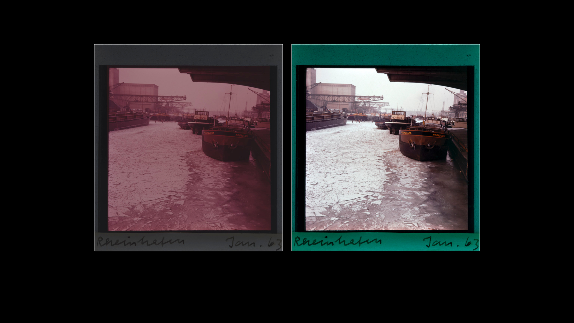
After a few rounds of scanning to figure out my best exposure, I landed on bracketing with an eyeballed center exposure as seen in the shot of my monitor. My goal is to maintain a steady exposure setting thru all shots. I mean, the backlight is constant, right?
Early experiments were overexposed on the high end of the bracketing and made for some awful NLP interpretations of the HDR DNG files. So I pulled it back and it cleared up. Also my starting WB was at 5600 and the shadows in the HDR images had some heavy purples. I figure due to color shifts AND too-low WB. So I bumped up to 6500K and cranked color noise reduction in Lightroom up to 100 and that helped a lot. This was before ANY other processing.
These scans use Noritsu color model, default presaturation, and slight adjustments of brightness, contrast, lights, darks, and shifting of mids and lows to yellow to warm it up. Any weird color shifts from shot to shot are very present in the original slides. Some are cool, some are warm.
A vexing occurrence is trying to sort out the shot of the sky-with-plane. That one isn’t HDR, and would only work out if I ran it with the border. Otherwise NLP thinks the blue should be dark mud. Is that because NLP is demanding a dark point that the photo isn’t giving?
All in all I’m very happy, and I’m going to proceed on the next roll to see if these settings all still apply. It’s not a super duper restoration, but rather a make-them-look-as-good-as-they-can in their present state.
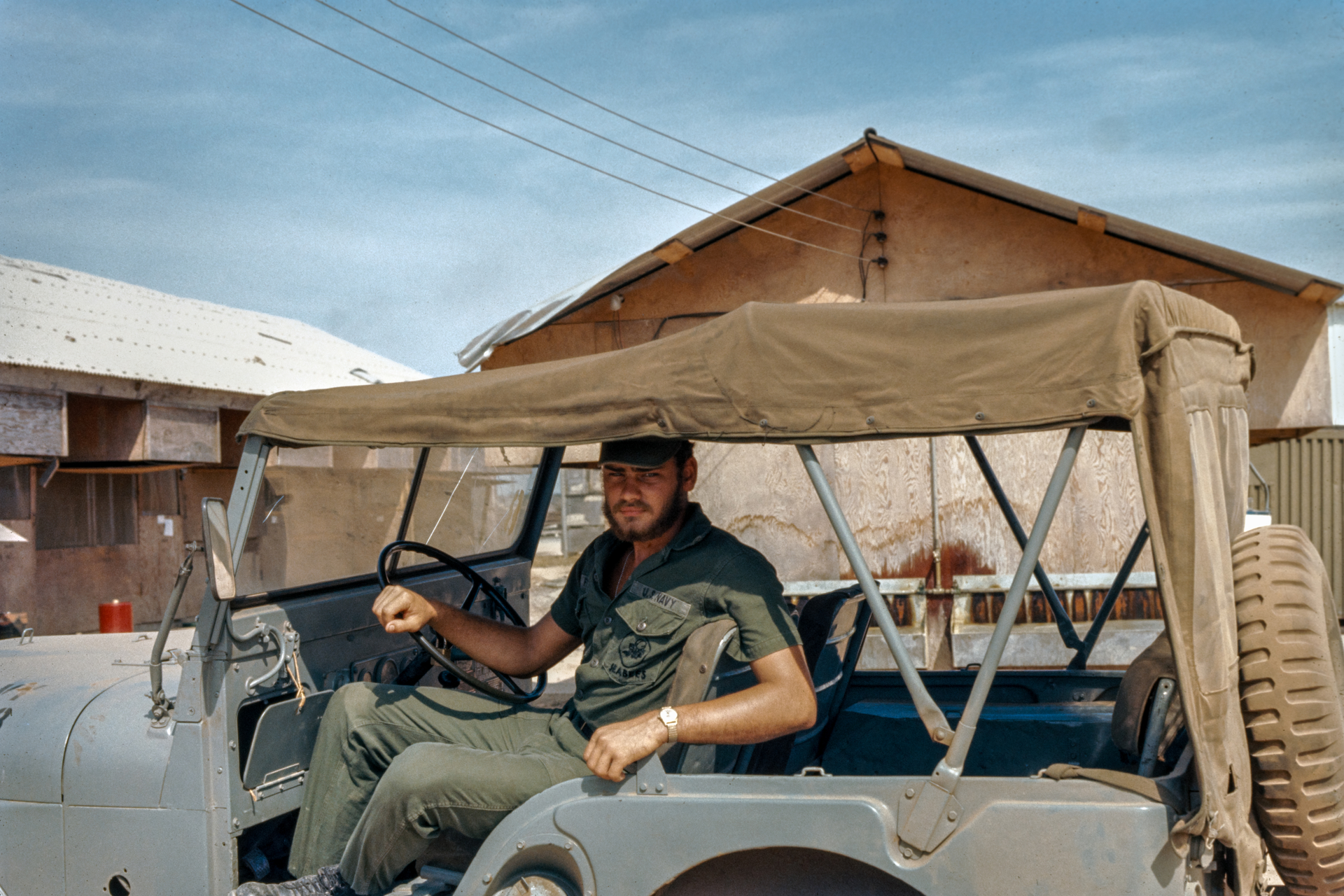
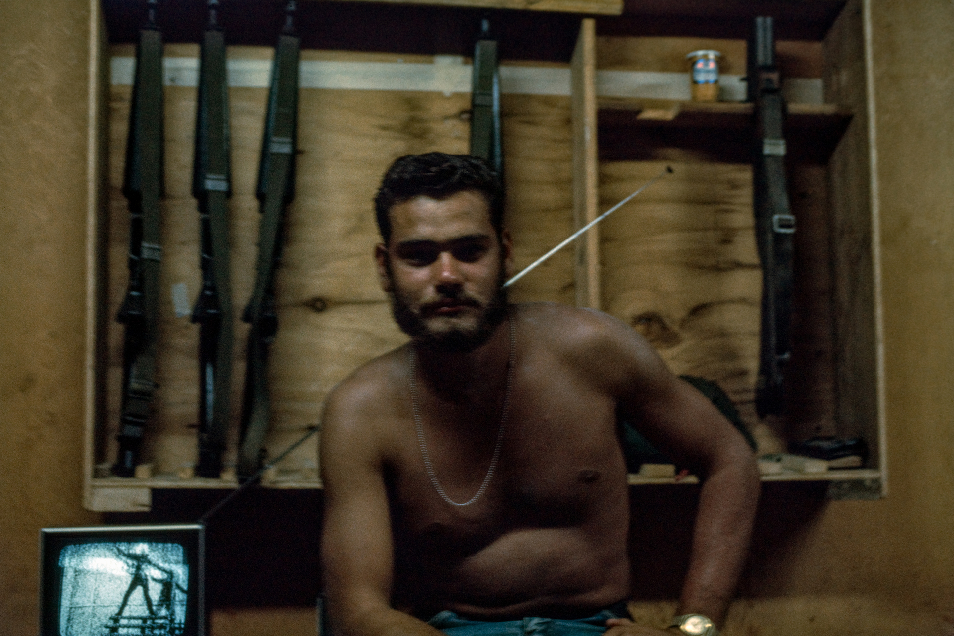
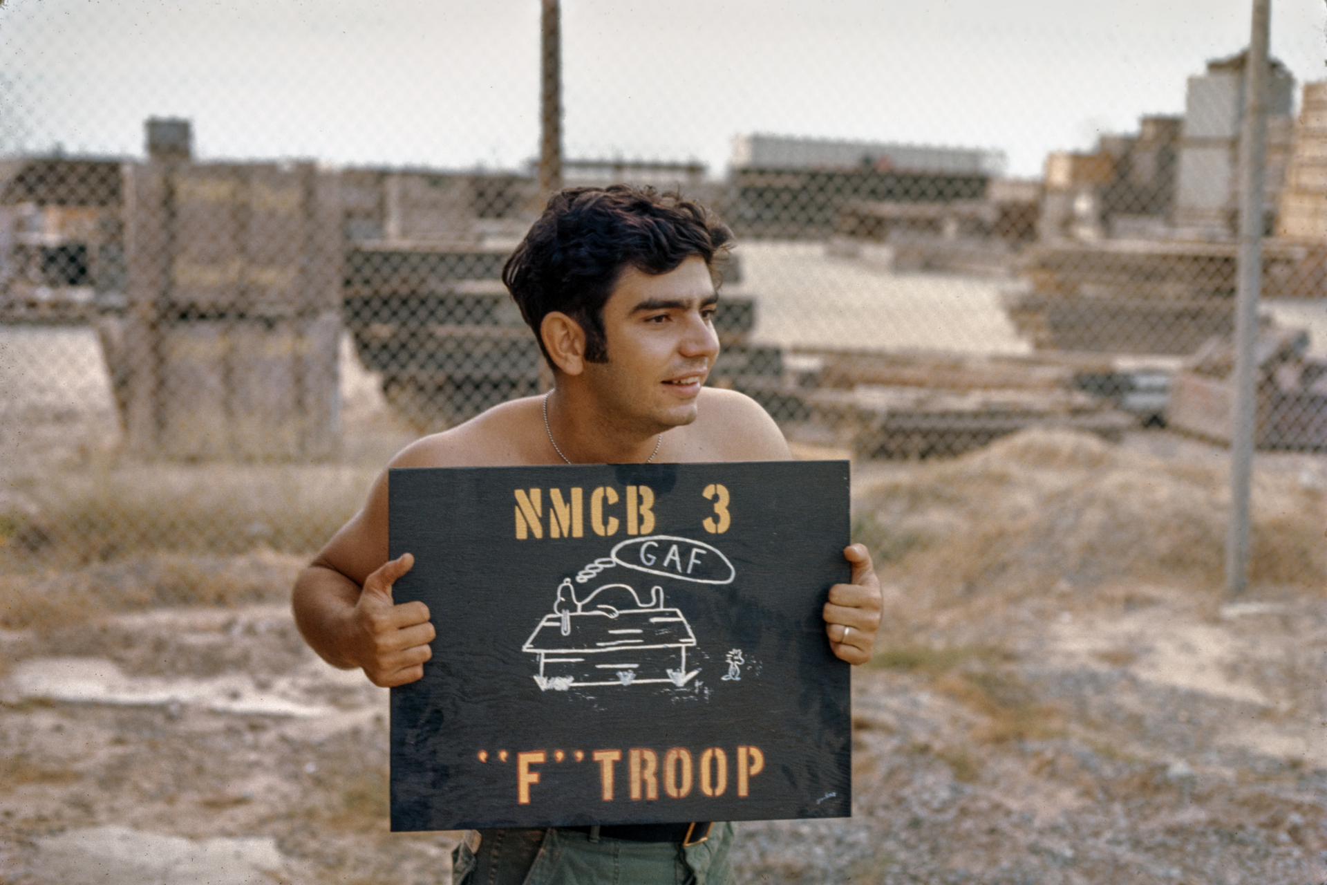
Oh, and these slides were developed in Feb 1971. Kodak Ektachrome. I think it’s Okinawa. Or maybe Guam.
Here’s my few cents based on NLP3.1 and tests with slides: Light source: I tried my custom built trichromatic source but that gives huge color shifts (very cyan skies etc). Slide film is made to be projected with a continuous spectrum tungsten bulb, so I used my Solux museum light bulb for slides and that worked fantastic (CRI>99, color temperature 4700 K, and it’s designed to mimic daylight accurately). The bulbs are hard to find, but one could also use the sun as a source I suppose. LED is never continuous spectrum and less suited, specifically for slides. Regarding WB: I include a scan of a blank part of the slide film strip and white balance (in software) on that shot. The scanning camera is fixed on daylight WB. White balancing in software on a blank film section compensates for the overall WB for the light as well as whatever color cast the the film strip introduces. At least that’s my theory (…). Your scans look pretty good already btw.
I should look it up but I don’t think that they’re obtainable any more, what is the difference in real terms between the Solux bulb and any other tungsten halogen bulb. They were after all the ones used in colour enlargers and projectors.
Two years ago I purchased two of the special Solux bulbs in a local store in Toulouse, France, after spending very long searching for them online. Maybe I was lucky. From what I recall they are indeed special and have a coating on the backside that lets the undesired light frequencies through towards the rear so they don’t end up in the spectrum that comes out the front. But it’s been a while so I don’t remember all the details. I suppose I was lucky finding them so I bought two so as to have a spare one. How much better they are than regular tungsten halogen bulbs I don’t know but there were some comparison tests online if I recall correctly. Anyway, if they’re unobtainable, then the search would be on for a continuous spectrum alternative since LED’s are not that. Maybe flash is?
Thanks, I’d say that you were lucky given that they haven’t been produced for so long. Information seems hard to get about why there were so good and so I’m still left wondering how they differed from normal tungsten. I saved a link a long time ago which just lists their MR16/GU5.3 range, 3 different colour temperatures:
I suspect that they were used for print viewing rooms and museum lighting and there are certainly LED lamps pitched at the same market now.
This database is out of date, I must see if there is another similar one that is more up to date, the Aputure ML-9 seems to rate well:
It was in 2021 and I obtained a lot of info there, but now the link is asking me for a login. I’ll look on my computer if I have more info stored there
Since my last post, I’ve tried some variations in NLP settings. With these earlier slides from 1970/71, I did need to do some tuning of the colors, usually trying to balance a bit blue-purple shift. As i progressed through the years, they became more and more… garish. Unnatural. Colors popped way too hard. Something was clearly off.
Then it occured to me there’s the Vuescan/SF DNG source setting.
I was already committed, for good or Ill, to the HDR DNG process, so I backtracked to reconverting them with the different source setting. And so even though Lightroom Classic’s HDR DNG isn’t 48 bit (or even truly raw), it seems to work a lot better. The colors are more muted and natural, and I can generally just set it to NLP Standard/Linear, bring down the Lights, and move on.
My ultimate goal isn’t to have each & every one pristine, but rather have them presentable for family so we can decide which ones to finish up properly for printing.
Anyone else out there trying out slides processing with NLP 3.1 yet? I’d love to hear your takes.
I’ve tested Kodachrome, Agfachrome and Ektachrome slides and got the expected colours out of them in most cases. The Agfachromes were badly tinted and hard to make do. The ones with a wider collection of colours were easier for NLP and to adjust afterwards. That’s to be expected though. All things considered, NLP did a good job - if I had set the crop right. Slight differences can be “amplified”, specially with slides that were looking unrecoverable.
I’ve posted an example slide and its conversion, but can’t find it quickly now
…so I made a new one, all I had to adjust manually was the white balance.
I don’t think you’ve mentioned how they look if you don’t use NLP at all, or at least before they go through NLP. Are they way off, too contrasty, difficult colour casts etc. etc.?
They run the gamut from great to gently faded to “why does this look pale green?”, and many are underexposed, overexposed, or have incorrect white balance. I latched onto the HDR because it showed great promise with the earlier slides, but since my last comment I realized it all looked a bit artificial. Maybe owing to how Lightroom goes about merging them? Maybe owing to the fact it wasn’t really necessary because they are in pretty good shape?
But since my last post I’ve abandoned the whole HDR scheme and am happy with the results I’m getting.
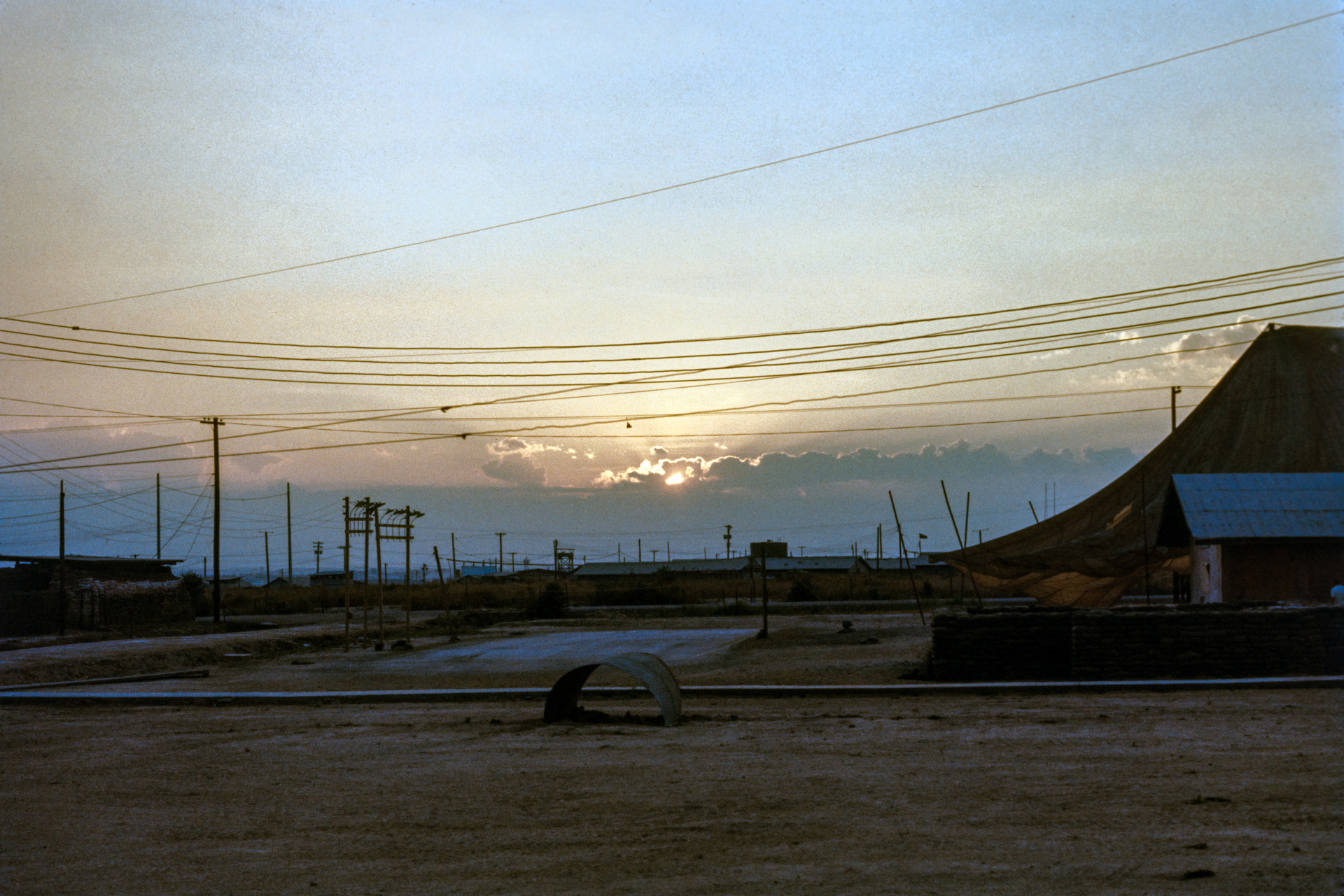
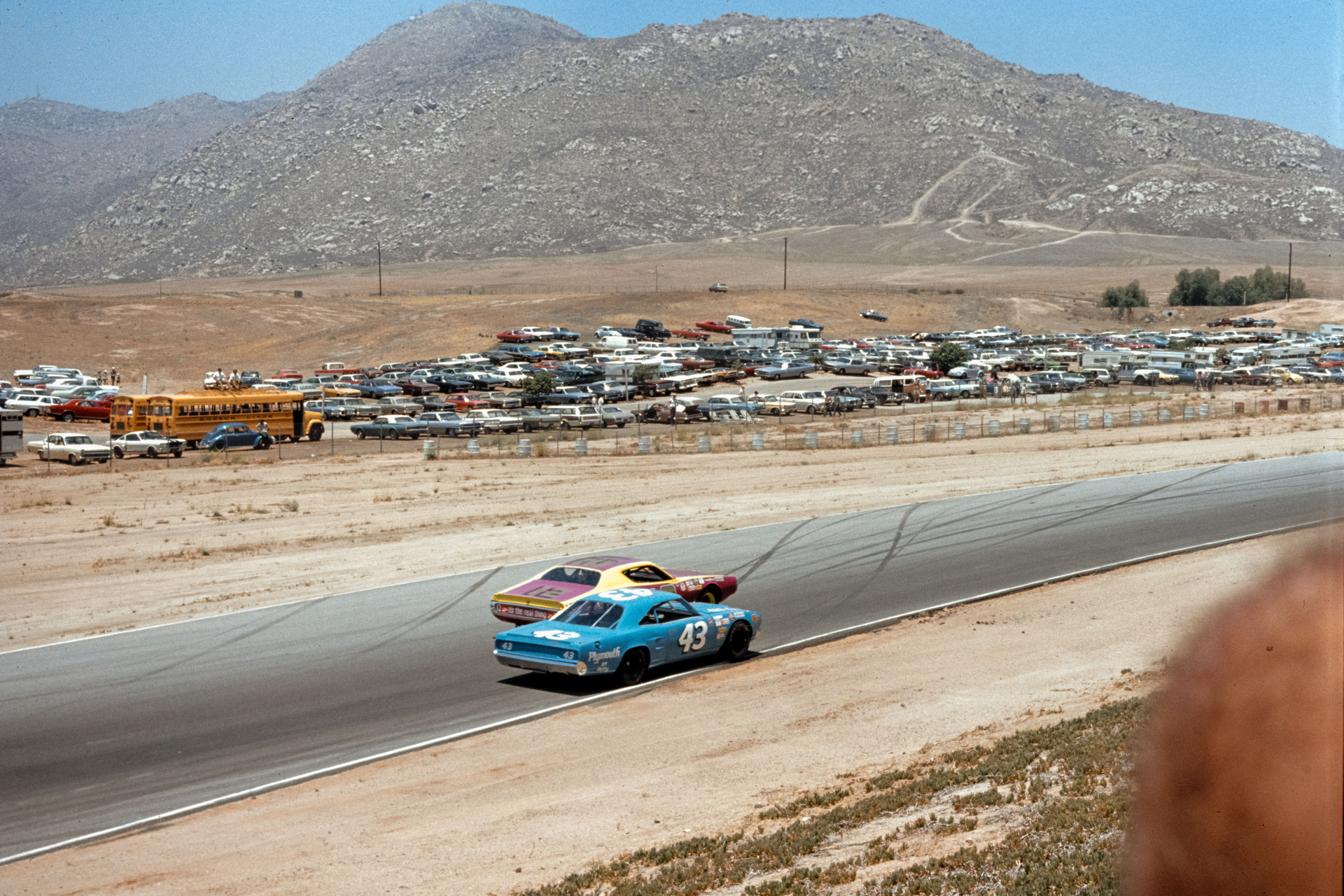
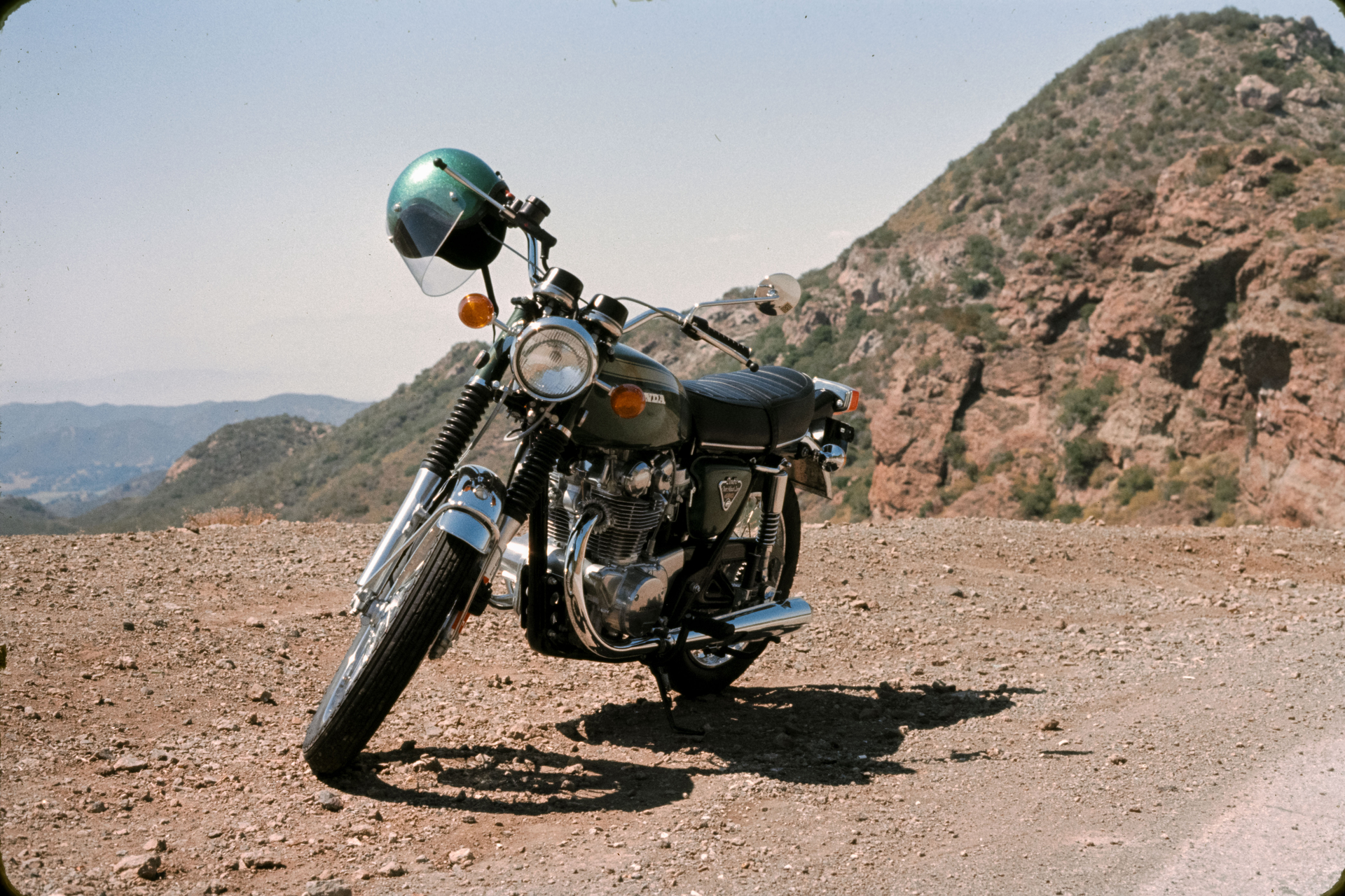
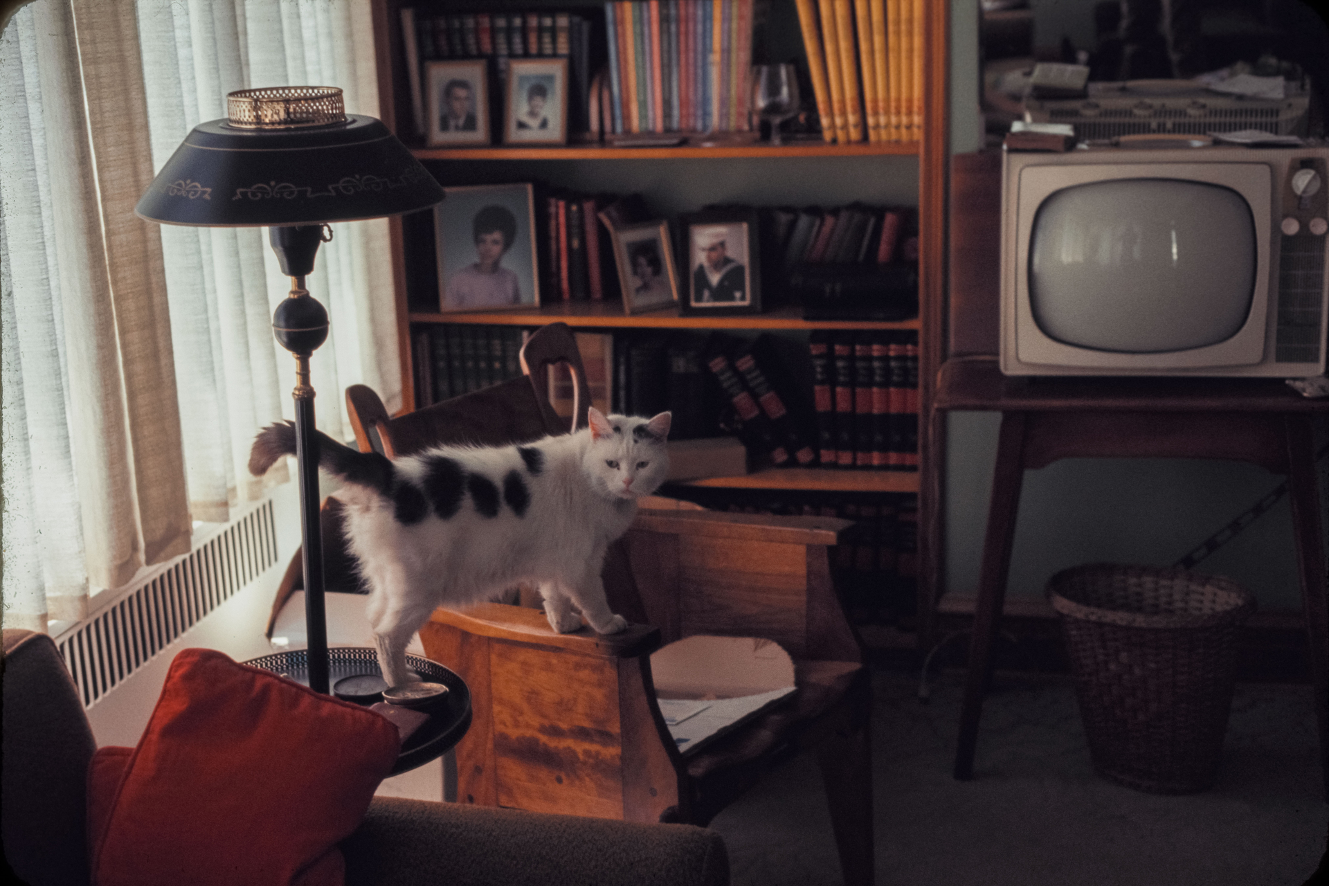
I run them through NLP for the initial processing, adjusting WB as needed, and exporting as Linear in TIFF. After that I’m letting Lightroom auto WB and auto Tone get me started with the rest. For fun I’ve set my Profile as “Negative Lab- Natural- Sat6”. Again, I’m not hanging them in a gallery, just sharing with family who would like to have copies. I’ve attached some samples from early-mid 1970s.
Thanks for posting, they look good to me but of course I haven’t seen the originals. The hope when using HDR merging would be to perhaps get more shadow and/or highlight detail so only you can judge whether there is more to be obtained from these slides (or if it’s worth the effort). Ideally for selected slides you ought to be able to use HDR on them and still consistently retain the same colour balance, which to me looks to be very good, so maybe there is something with Lightroom’s HDR merging that is going wrong.
As I write this it occurs to me that ‘HDR’ is also used for the new wider colour space images for displays that will handle it, current Apple products for instance. It’s surprising to me that they couldn’t come up with a different acronym for this.
It was my first time using the HDR Merge in Lightroom, and there are a LOT of slides, so I bypassed the dialog box by pressing Alt with each merge. Maybe it was some uncontrolled automation that was happening; saturation punched way up. These heavy purples and blues in the shadows. i can’t show my work because I’ve since deleted all the DNGs to free up space. I think the slides are fine as they are, though. The processing I have done has brought up dark levels enough on some that I might go back and reevaluate later. It’s easy to fall in love with all this new detail but then i worry I’ve changed the reality of the photo too much.
Hi Flint, your scans look absolutely incredible! Especially the first one of your father in the jeep. You did a great job scanning and editing a very natural and authentic look that really showcases Ektachrome from the 70’s. I see you are well covered with all the great technical advise you already received from everyone, I just wanted to commend your work and let you know these images look absolutely incredible!