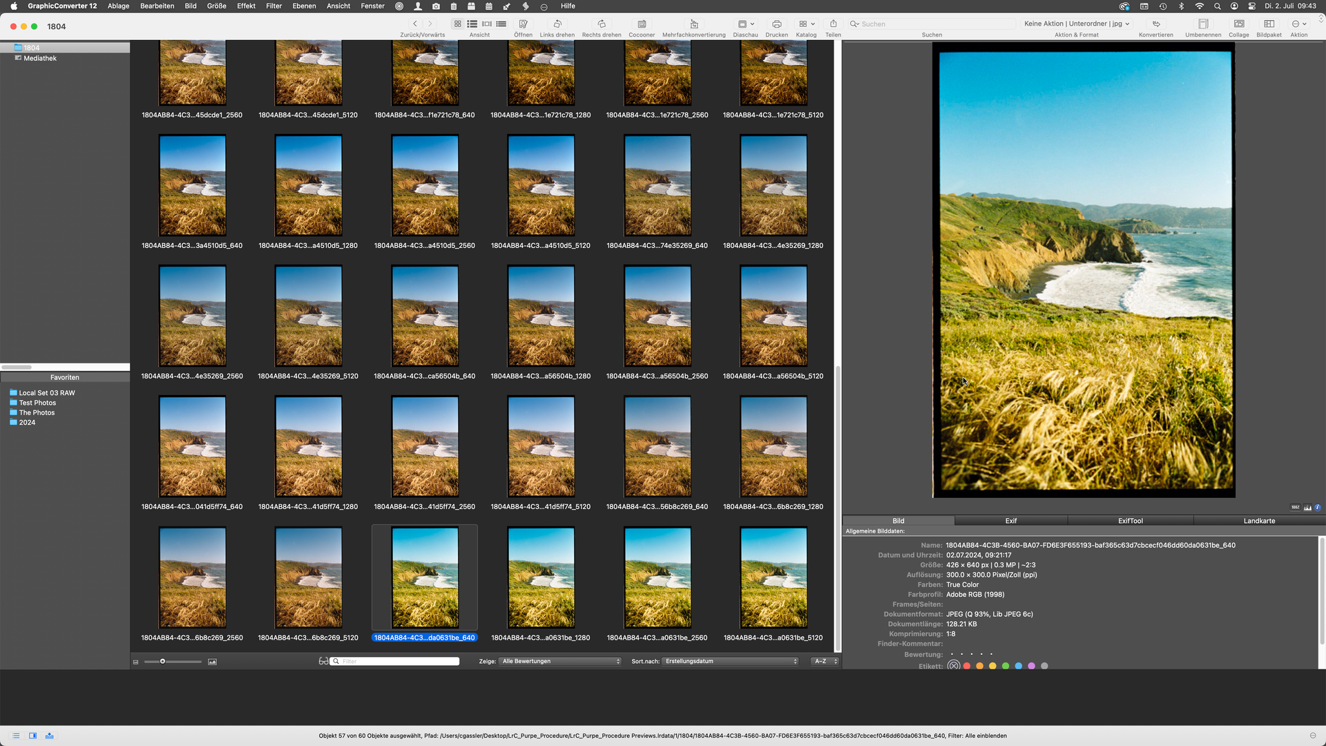
I keep running into the same issue with my Portra 400 shots. I am comparing what I do with the lab, and the lab gets much skies (greener/softer) and better water. I keep getting super saturated purple-blue skies and can never get the water to look as good. Here are some shots and my settings. Happened on other photos as well. first is lab; 2nd is me. How can I fix this?
Negative Lab is providing a starting point that you can modify to your liking with all the sliders and dropdown selectors. I propose you try to adjust your image starting with the saturation controls of Negative Lab, be it with the one shown in your second screen capture or with pre-saturation on NLP’s first tab.
You can also post a link to the original scan of the negative and we could try to find the settings that make your conversion look closer to your lab scan.
save the settings as a new preset and test it on other “difficult” images
The systematic procedure outlined above can help you learn NLP, but it does not guarantee that what you find will be a cure-all. Nevertheless, it can get you pretty close:
As often, we get a 20-80 mechanism - and the above was achieved with relatively low effort. Getting the last 20% will take more effort and/or a positive copy.
Note that the procedure is meant as a general approach for negative copies and for low drive space requirement. Alternatively, make a positive copy early on and use the Lr tools to fix hues and tonality. This breaks the RAW workflow, but with TIFF scans to start with, it might not matter.
Is it worth saying that neither the Lab or the NLP version is wrong, colour negative is by its very nature subjective and labs can create a certain ‘look’ depending upon the machines they use and the operator using them.
I’d say that the NLP version is more how I would expect a coastal scene in bright sunshine to look, the blue sky and the vegetation look natural to me, and I somehow suspect that is closer to how Kodak would have meant Portra 400 to print, totally subjective on my part of course. However that is in no way a criticism of how you want it to look.
Very interesting to see Digitizer’s grid method of working, certainly I’ve learnt something.
indeed, colour is mostly a matter of taste, unless one works in the field of reproduction, in which case you’d also include a colour target…which might not help for landscapes because of their depth and uneven illumination
As for the two examples given by @fpb in the original post, I’d probably change both to get something in the middle. I’d also reduce overall saturation. QED
My take on this is a bit different. The lab version is no good. When was the last time you saw a Cyan sky? Your version done with NLP is much closer to what a blue sky can be expected to look like. However, let’s say you’re not happy with it and if you wish to remain in a raw workflow in Lightroom, the best way to change the overall colour balance of an NLP conversion is to work within NLP, and use the closest of the WB choices in that drop-down, then if you need further adjustment, very careful adjustment of the Tint and Temp sliders.
If you wish to change only one colour, e.g. the sky, you would mask the sky in Lightroom and use the Tint and Temp sliders in the LR adjustments panel for masks on the masked sky until you achieve the hue you want. Except in this case, you move the sliders in the counter-intuitive direction - so for example with the Temp slider, if you want more blue you move the slider toward yellow.
You can also do this with the R, G, B curves in LR but I don’t recommend that route because it is VERY finicky.
As usual in digital imaging - numerous approaches.