Hey everyone,
I’ve done some experiments lately to find out which scanning method leads to the best results and I’ve had some unexpected results.
I have access to a Nikon Z6 mirrorless camera with a Sigma 50 mm f/2.8 EX DG Macro and to an Epson V600 flatbed scanner. The Nikon Z6 is undoubtedly better for 35mm film, but the flatbed scans seem similarly sharp to the mirrorless scans for the larger medium format film. However, I have mostly preferred using my Nikon Z6 because the flatbed scans always had some weird/less appealing colors after initial conversion with NLP that proved much more difficult to fix.
I have since acquired an IT8 calibration transparency and made an ICC profile for my scanner and found out that the default colors were extremely off. I can obviously only make use of the ICC profile when exporting normal 48-bit TIF files from VueScan, so I decided to give that a try. Up to that point, I had only been using RAW DNGs from VueScan as per the NLP instructions, but it seems that using 48-bit TIF files recorded with the generated ICC profile leads to scan that are much easier to work with (at least for me). I converted all the files in Lightroom Classic using NLP v3.1.1 using the Basic Color Model, a Pre-Saturation of 3, a Border Buffer of 5%, ToneProfile LAB-Standard and WB Auto-Neutral (for the two RAW scans I also used the Color Picker to WB off the film edge before conversion) and did no further editing and here are the results on some Portra 800 (merged into one picture because I’m only allowed to post one picture per post):
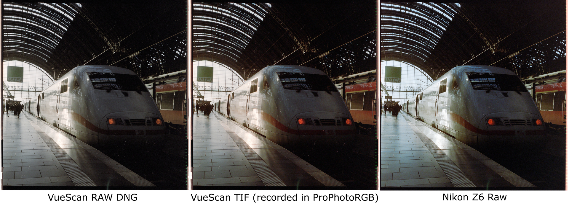
I thought I’d share my results since this (at least apparently) goes against the normal wisdom of using RAW DNGs for best results with VueScan. Maybe one could still theoretically get better results with the RAW DNGs, but it would need way more messing around with the colors to get it to look good. I’ve tried the same process for the whole roll and all RAW DNGs had the similar issue of being weirdly desaturated (especially in the reds) and sometimes a bit too blue/magenta.