Okay, let’s see what I understand from the thread (about oversaturated greens) you linked to in relation to what I read in your post(s)
The Kaiser has white LED indeed and there is a post about using an iPad as backlight, albeit in a slightly unusual way.
Making the backlight “monochromatic” helps in this special experiment, but it does not add any magic in all other cases as far as I’ve tested. BTW, I later ran the test with the CMY backlights - basically a waste of time in a RGB world.
[quote=“pehar, post:14, topic:20293”]
having a CRI of > 95 Ra. This gives me an excellent base to get natural looking colors after inversion and compensation of the orange mask
[/quote]
Now I am a bit confused. From the parallel thread I thought I learned that an illumination at 3 distinct wavelengths would be much better for negatives as the orange mask would not spill into red and green. Now a high-cri spectrum (i.e., more white, including orange) gives better results. Confusing. Any thoughts?
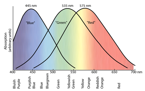
In a model world, red, green and blue would be “pure” colours and our eyes and camera sensors would exactly see just that: red green and blue. In the real world, our brain recognises something as red, green or blue (or yellow or cyan etc.) because our eyes get overlapping colour information from whatever they see. The same goes for camera sensors, here’s an example of how they separate colours:
Our brain relies on (has to cope with) overlapping colour information and so does the firmware in digital cameras. Take away all the light hues that are not r, g or b - and get a completely new world of colour vision. Even in a digital world, there are infinite shades of grey or colour between black and white. It’s mostly politicians who manage to reduce our world to either-or.
To make a long thing short:
get a high CRI backlight and work with it (best practice as accepted in this forum)
or try whatever alternative you deem promising and let us know, what your findings are
Hmmmm. Clearly more experimentation is needed. RichardB, can you scan your negative with a late model iPhone or iPad or some other light source made of distinct red, green, and blue light? Or can you have it scanned on a film scanner like the Nikon Coolscan or Minolta Dimage or Noritsu or Fuji Frontier. Would love to see if you get the green you see in your print.
Thank you Digitizer for your detailed answer. You inspired a day of experimentation to see if my camera sensors red channels see that much green. (My Sony A7R2 and NEX-7 in RAW don’t). I know that our NLP community has settled on high CRI white light. But I can’t help thinking that some really smart photo scientists went the way of narrowly cut RGB light sources and that Giorgianni’s explanation for that makes sense.
RichardB and replies above suggest an interesting question. Should we be trying to match colors with the original subjects or with silver prints. RichardB’s example to my eye looks better in his print. But I have many scans that look better than their silver prints.
RichardB has documented a distortion of color sensitivity that Weatherly and Giorgianni would have predicted. For an NLP best practices “scan” we white balance on the orange mask, that is, we subtract out the orange seen by our DSLR/light source system. But we also subtract out the orange that was produced by the photosensitive layers in the film from the complementary color in the scene. And that color is greenish blue or teal. Imagine taking a retouching brush with that color to RichardB’s NLP scan!!
That brush with teal dye would have to be applied only to the parts of the image that were actually teal. This is to say that no over all color balance change can fix his image. Information has been lost with our white balance on the orange mask.
Would love to see this negative scanned with a Coolscan, Dimage, Fujitsu, or Frontier.
I think my description above was not completely accurate. RichardB’s information was lost because the system saw the orange mask like the image of the green grass. But we get to the same conclusion. The best camera/illuminator will not see the color of the orange mask but will see the color of the grass. That system should have very narrow peaks of RGB color sensitivity — just like photographic paper---- and commercial scanners I suspect.
I’m not sure if this model (subtract out the orange that was produced by the photosensitive layers) is correct. If it were true, no print (be it traditional/chemical or digital) could show anything blueish.
As always, models make things easier and sometimes they oversimplify things, making them wrong. The orange mask translates into black and if some blueish light hits the film, the density of the film will increase, no matter what color the film substrate/mask has. Initially, the film emulsion is opaque and is directly hit by the light. The opaque parts of the emulsion is bleached away during development (unless bleach bypass is used)
All in all, color rendition is something that varies by brands (film and digicam) and processing, we have to live with that and develop some kind of tolerance towards variation. If the processes we use give us something that does not please us, we must try to correct it. Moreover, every iteration of a product can change the results…

